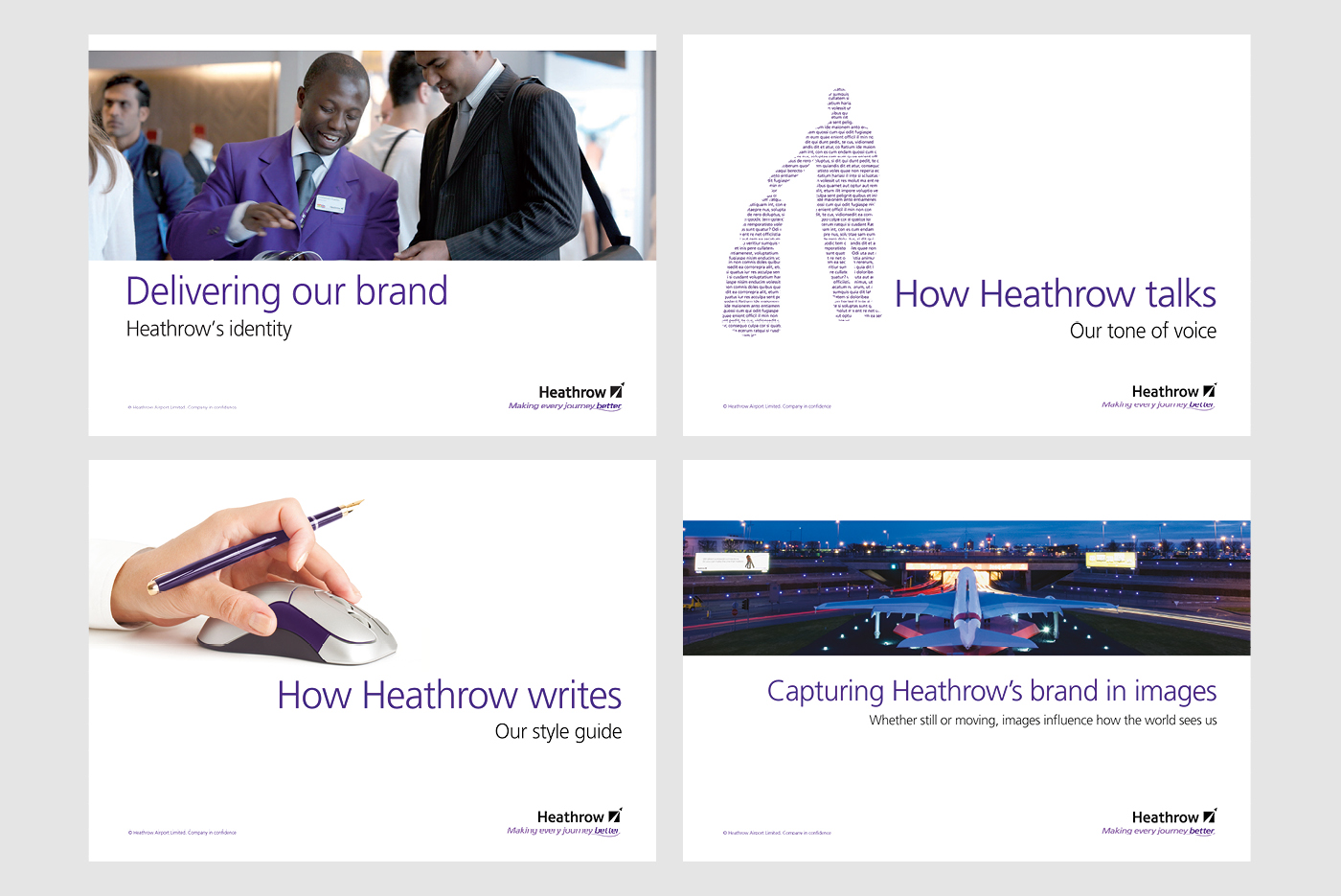
Heathrow’s identities
When ‘BAA’ was broken up by the Monopolies Commission forcing the sale of Gatwick Airport (and Stansted a few years later) each airport had to stand separately.
By 2009, we had introduced a strapline and palette of colours to differentiate Heathrow from other airports.
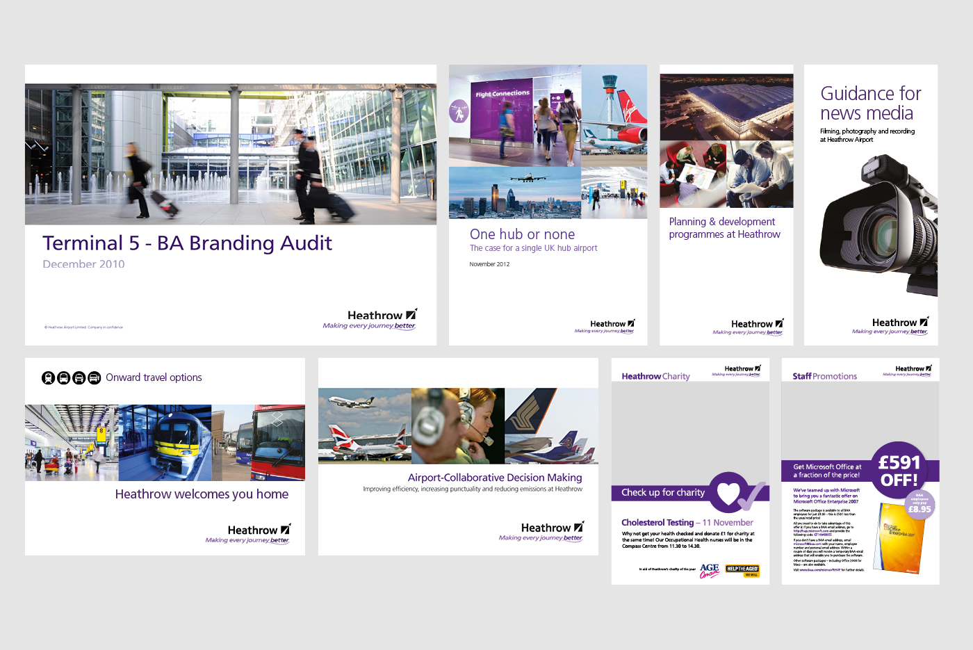
It was all rationalised into a set of identity guidelines that explained how they should talk, write and brand themselves. Over 1,800 comms pieces were rebranded over the following two years.
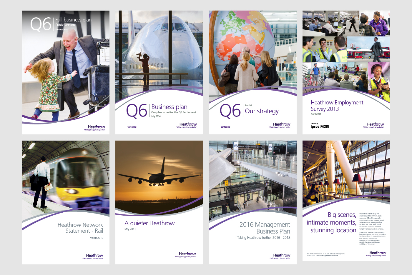
By 2014, the logo was further refined and intersecting curves were used as a graphic device to show Heathrow’s ‘worldly’ reach.